Suki

Opportunity

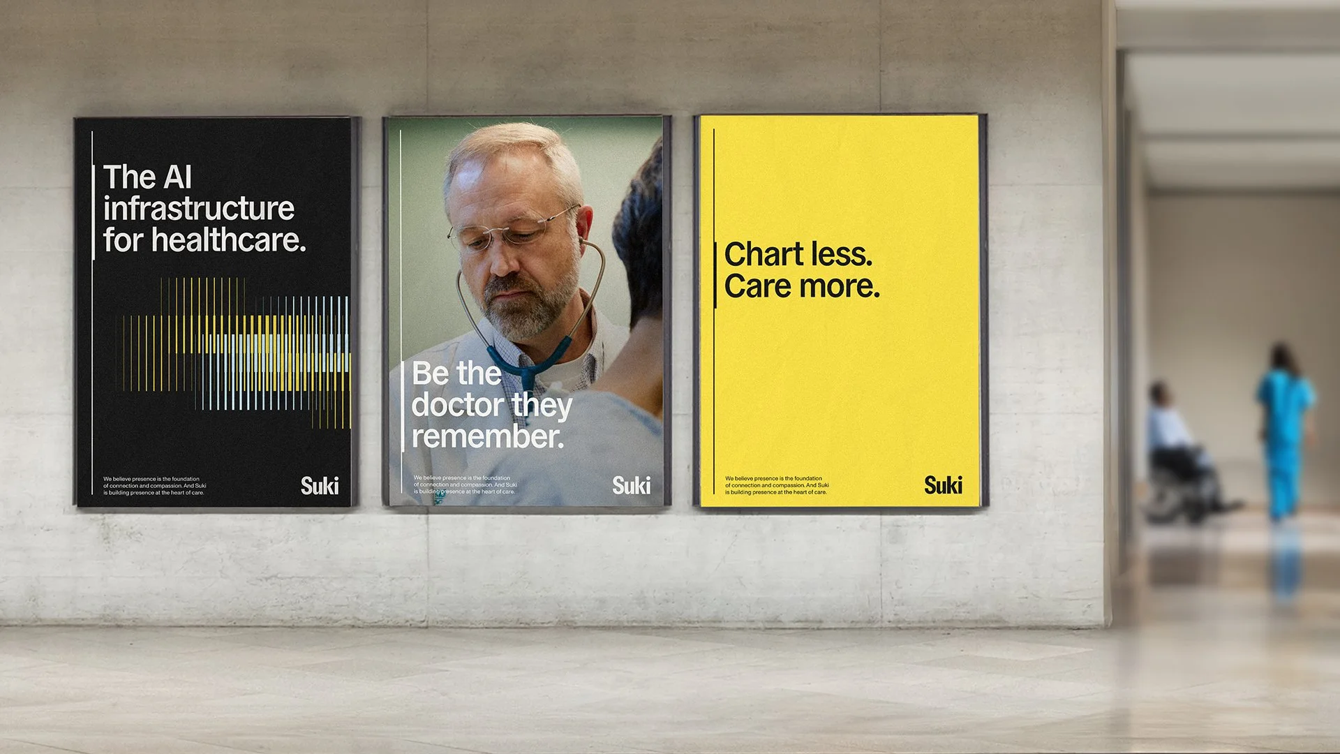
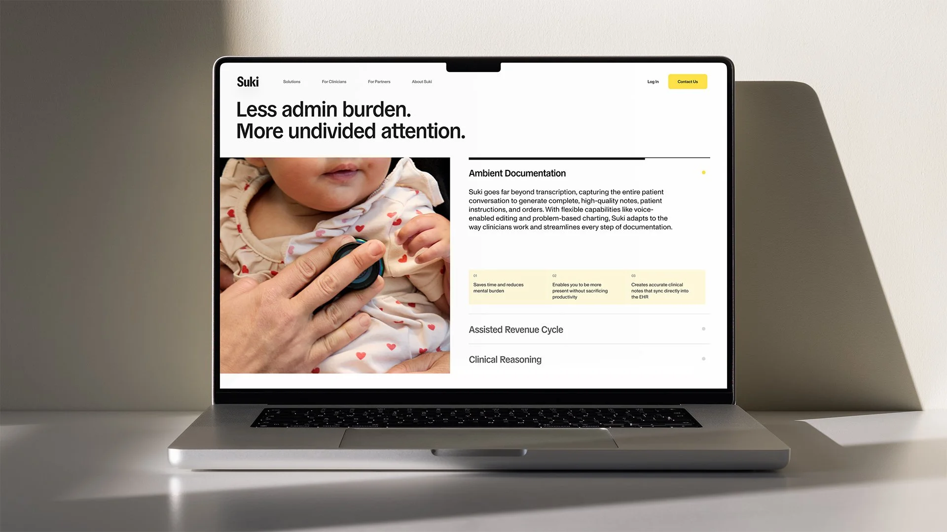
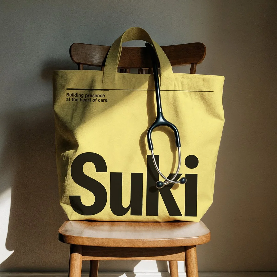
Within a saturated market of "ambient AI scribes," Suki aimed to translate its differentiated product offering into a cohesive and compelling narrative that clearly sets it apart. They wanted their brand identity to resonate with the grit of practicing medicine, elevating the conversation from productivity to purpose.

Outcome

We translated presence into a cohesive identity system, avoiding the visual tropes dominating healthcare AI: abstract gradients and glowing orbs. Instead, through a graphic linear system, we expressed Suki's assistive role with clinicians — always in motion and seamlessly integrated.

We shifted the primary brand color from category blues and greens to yellow, introducing warmth and optimism into a space defined by seriousness and fatigue. And we redesigned the logo to sit comfortably within this visual system — bolder, more contemporary, confident, and aligned with Suki's leadership.


Whether in an exam room, meeting room, or living room, we all feel the difference when someone is truly present. With presence comes focus, trust, and a sense of being seen as a human, not as a transaction.

Suki's new vision: building presence at the heart of care, became the foundation for an identity system that gave the strategy form, voice, and coherence.


A BUCK project.